
Data Visualization
Data Visualization is the model of arranging the raw info in the graphical format. Which is most widely used in many fields nowadays for analysis and also for finding the exact statistical view of each and every process.
It helps the society to understand the distinctive information by graphical representation and organizes a huge amount of information in a simple and easy way to grasp the format that helps to spread information audibly and convincingly.
Creating agreeable visualizations and sticking them together into dashboards is not just an exercise for furnishing information to the masses.
Here one size cannot fit to all.
You need to do more than simply showing, like observer response, estimate benefit, and serving the results with everyone you know
Best Exercise
- Forecasting should be used to equip a specific audience and convey their needs
- Select the needed visual for your desire
- The Context gives rise to trust, which steer to action
- Keep Envisions and dashboards Uncomplicated and absorbable.
- Plot to retain users busy
First , we need to know the about information
What is this Data?
• Real-world meaning of the data – information
• Structural or mathematical interpretation
• Both often require Meta information – Sometimes we can infer some of this information – Line between information and Meta information isn’t always clear
Information is nothing but an information which can be in the form of character or numbers that can be collected from various resources.
For an example, we consider the COVID – 19 situation everyone will be keen to know the status of their state or city whether there is any increase in new cases and deaths.
It is difficult to show this information as daily update. This process can be easily shown to the public with the help of visualization.
Computable messages
There are 8 types of Computable messages that everyone attempt to recognize or transfer from a set of information to related graphs which help to communicate the message:
1. Time-series: All kinds of charts can be represented in this set of series because it helps in finding or analyzing the generation of information in Chart.
2. Glassy: This helps to picturize the rising and falling down information in a charted format.
3. Evaluating a portion: This process helps to find the particular portion of the given data set or data frame.
4. Deviance: Unqualified portions that is comparing two data sets also possible.
5. Regularity spreading: clarity between the regular intervals can be visualized
6. Correlation: Evaluation between observations represented by two dimensions is possible.
7. Minor appraisal: Comparing resounding parts in no particular order, for instance, it deals with bulk by product code.
8. Earthly or Geospatial: To construct chart across a map or layout, for example the joblessness in the time period.
Types of data visualization
- Charts
- Graphs
- Maps
- Info graphics
Sample Plot
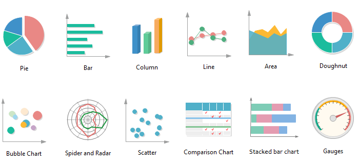 Sample Plots
Let us discuss about few of the plots that we have regularly seen in our daily life but not known what kind of representation is this plot
1. Bar Plot
At any time of our life time we have seen somewhere this bar plot kind of representation. For an instance in our life this can be viewed in comparison of marks.
Where and when can I use a bar plot?
- Used to relate one or more set of information
- Used to relate portions of a whole
- In many clusters (less than 10 works best)
2. Line Plot
This kind of plot which mainly we find this kind of plotting in hospitals helps in the progress details. Mainly this plot can be utilized with unbroken dataset
Where and when can I use a line plot?
- Charity to find the statistical view of information
- Castoff in time series data representation.
- Hand-me-down to realize how multiple analogous information data matches with each other.
- Recycled in investigatory sciences.
3. Area Plot
Similar to line plot where this helps with shading the area between the lines. Mainly this plot can be utilized for comparison between groups.
Where and when can I use Area Plot?
- Castoff to track details between public and private groups.
- Hand-me-down to track how data developed over the time series.
- Charity to track different shares.
4. Choropleth plot
It’s a kind of plot where real world structures are utilized. Mostly for viewing population related details may have seen this kind of plotting.
Where and when can I use Choropleth plot?
- If you have geometric information
- With list of reference indexed values featured
- In real world properties (eg COVID 19)
5. Lollipop Plot
Similar to bar plot which is represented with line and a dot. Illustrate the relationship among numerical and categorical records.
Where and when can I use lollipop plot?
- Used to avoid clusters in bar plot.
- Monitor the group performances.
- Used in a group there are many associate groups.
Conclusion
There are many tools which help to perform visualization. These tools help us to handy way to see and understand styles, outliers, and designs in records. When you are erudition this skill, focus on best observes and discover your own particular stylishness. Data visualization is not going to be fruitless the situation so weighty to form a groundwork of study, storytelling and study that you can transfer with you and end up using regardless of the tools or software.


One Comment Hide Comments
Excellent blog sir.